| Alone Together

The path ahead is challenging but clear: we need to start reclaiming conversations once again. Icon Source: Entypo.

The path ahead is challenging but clear: we need to start reclaiming conversations once again.
Icon Source: Entypo.

Click on the image above to view the video.

This week’s viewing is a TED Talk by Sherry Turkle, professor of the Social Studies of Science and Technology at the MIT. She has spent the last 30 years researching the psychology of people’s relationships with technology.

What struck me at once was the title of the video itself: it emphasizes how we seem to be brought together by technology, yet these elements keep us isolated from each other in terms of social and human interactions. We have never been so connected, yet never so alienated from each other.

In her video, Turkle explains how not too long ago, scientists were trying to figure out how they were going to keep computers busy: for example, they wondered if people would be ready to put their contacts and calendars in the hands of technology (which at the time seemed like a foolish idea, she explained, because people were too attached to the feel of paper). Ironically enough, now it is the other way around, it is the computers that are keeping us busy. Indeed, we seem to have become addicted to this mobile connectivity mainly because our phones, computers, tablets and other electronic devices are always on, and always on us. This developed a certain vulnerability in us, which Turkle explains by the constant connection technology offers. Indeed, we have become intertwined in this mix between reality and virtual life. As a result, we seem to avoid real life commitments (like talking on the phone) and we prefer texting than talk to a person face to face. Turkle clearly states that we have developed an addiction to technology, but we are nowhere near accepting of letting go of this “drug”. In other words, we are slaves to our technology, but we like it.

Another important issue that Turkle mentions in her talk is that we have become too busy communicating to think, or even to create. Distractions are all around us, all the time; we cannot think without being interrupted.Therefore, we have lost the notion of being alone, and we do not know how to restore ourselves in solitude. Even in the most intimately alone time, we do not take the time to reflect on one’s self; instead, we see this free time as an opportunity to check our cellphones one last time… Even when we go the use the bathroom, most of us take our phones with us !

Needless to say that this flood of connections affect the self in many ways, since we are becoming lonely, longing for friends yet fearing the actual long-term commitment that comes with an actual in-flesh relationship. It is obvious that the time has come for us to turn the camera towards ourselves, to look ourselves in the mirror and make corrections on our addictive behavior. Like Turkle said in her video, the path ahead is challenging but clear: it is time to reclaim and start conversations again.

| Art & Synesthesia

The synesthetic experience of a synesthete is a real and concrete sensory phenomenon. Icon Source: Entypo.

The synesthetic experience of a synesthete is a real and concrete sensory phenomenon.
Icon Source: Entypo.

The reading for this week, “Art and Synesthesia” by Dr. Hugo Heyrman, highlights the relation between art as a synesthetic experience, and the experiences synesthetes have on a daily basis. Although I was familiar with the term synesthesia, I was not aware that synesthetes could actually have more than two linked senses. I was also surprised to learn that most synesthetes have incredible memory abilities as well; I thought this was true only for autists.

First of all, art is about moving the viewer by making them connect emotionally to the piece. That phenomenon itself leaves room for some synesthetic experience from the viewer, since he will hopefully connect unrelated concepts when engaging with art. This could be related to the cross-sensory perception that natural-born synesthetes have, which is what inspired artists from different times to experiment and cross all kinds of borders in their art. For example, the text mentions Luigi Russolo, a Futurist composer who experimented with music, sound, noise and the grain of voice. He created noise-generating instruments, which allowed the inclusion of noise into his musical compositions.

Furthermore, the wonder of synesthesia is the ability to trigger senses due to the stimulation of other senses. When this condition is transposed to art, one obtains paintings that can evoke sounds, pictures that can evoke textures, sounds that can evoke images, images that can evoke smells, smells that can evoke visuals… the combinations are endless ! And needless to say that the experiences differ most of the time according to the person who experiences the art piece, just like the experience of one synesthete differs from another.

Like mentioned in the text, synesthesia enabled artists of modern art movements of 20th Century (Expressionism, Futurism, Dada, Surrealism, De Stijl, Abstract Expressionism, etc.) to reach new heights of creativity. Nowadays however, art as we used to know it has been replaced by multimedia, which kind of achieve the multi-sensorial synesthetic experience by the means of different medias. As we continue to create new technologies, we should never forget that whatever the nature of the piece, the viewer should continue to be engaged in moving and emotional experiences.

| [Assignment 03] Titling Sequence

Title Sequence for an infographic video on breast cancer.

Title Sequence for an infographic video on breast cancer.

Click on the image above to view the video on YouTube.

Short 10-second title sequence for my DART 381 class (Digital Concepts and Multimedia) for a 2-minute infographics video on breast cancer.

Animation created by Roxanne Desrosiers (2013).

For educational purposes, the music used in this video is an instrumental version of Atlas, by Coldplay (2013).

Obviously, I decided to do the opening sequence on pinkwashing, so I will be able to reuse it for  my final video. I kept the general aesthetics that I presented in my proposal, so that there will be a certain unity between the title sequence and the infographics itself. Music and sound effects have not been added to the titling sequence, since I have not yet decided if music or a voiceover will be used in the final video.

| Patch for Adobe After Effects on OS X Mavericks

Quick link to a patch to install Adobe CS6 After Effects update.

Quick link to a patch to install Adobe CS6 After Effects update.

My friend shared one very useful link on her own class blog in order to update Adobe CS6 After Effects so that it will run with Apple’s new operating system (OS X Mavericks). It saved me a lot of time, so I thought it would be a good idea for me to also share it on my blog to make someone else’s life easier.

Click on the following link to land on Adobe’s download page: www.adobe.com/support/downloads/

During the installation process, I heard you may be asked to close the “Adobe Crash Deamon” application. Essentially, this application is a process that monitors Adobe apps for crashes and helps report them. I did not have this problem, but you can always follow these steps to close the application:

  1. Open your Activity Monitor (Application > Utilities).
  2. Using the search field up top, search for Adobe Crash Deamon.
  3. Delete it.

After that, you are ready to finalize your installation process, which only takes a few minutes. Afterwards, you will be able to open up  After Effects without any problems !

| Titling Sequences & The Role of Saul Bass

Saul Bass was a Jewish-American designer, who became famous both for his corporate identity and graphic work as well as for his contribution in the film industry. Born in 1920 in the Bronx, New York, he created some of the most compelling images of American postwar visual culture, such as corporate identity campaigns for AT&T, Quaker Oats and United Airlines (Bass and Kirkham). However, in the late 1950s, Bass extended the limits of his graphic design career by starting to make film titles. Without a doubt, among his best-known works in film are the title sequences for such classic films as Otto Preminger’s The Man with the Golden Arm (1955) and Alfred Hitchock’s Psycho (1960), two motion pictures that have played a significant role in the development of this new genre in film industry.

Before the advent of Bass’s title sequences in the 1950s, not much action was happening in the actual titles sequences. Film titles in American movies of the early to mid-1950s generally followed the style of a rather static kind of graphic design mostly found in typical Hollywood title designs at the time. These early title sequences, called “title backgrounds”, consisted of a fairly short list of credits, written in unimaginative lettering, displayed over a static image that often represented the genre of the film (Kirkham). In fact, in an interview with Los Angeles-based graphic designer Pamela Haskin, Saul Bass himself qualified older titles as being made “strictly with typography, mostly bad typography, and constituted the period when people were settling in, going to restrooms, or involved in chitchat” (13). In other words, the projectionists at the time only pulled the curtains once the titles were finished, letting the audience know that the actual movie was starting. Thus, nothing was truly genuine in film sequences before the arrival of Saul Bass in the film industry in the late 1950s.

My initial thoughts about what a title can do was to set mood and the prime underlying core of the film’s story, to express the film in some metaphorical way. I saw the title as a way of conditioning the audience, so that when the film actually began, viewers would already have an emotional resonance with it.
– Saul Bass

Opening title sequence for the AMC series Mad Men. Image Source: http://suvanisuri.files.wordpress.com/2011/07/mm_end_frame1.jpg

Opening title sequence for the AMC series Mad Men.
Image Source: http://suvanisuri.files.wordpress.com/2011/07/mm_end_frame1.jpg

With Bass’s collaborations in films such as Otto Preminger’s The Man with the Golden Arm and Alfred Hitchock’s Psycho, the American designer served as a kind of founding figure who paved the way for graphic artists to follow, developing an aesthetic which has the ability to offer a reading of the film and its main theme before the film even begins. The typography combined with the animated graphic elements allow this to happen in Bass’s opening sequences. Needless to say that even today, we still have homages to Bass: the opening sequence for the AMC television seriesMad Men, which combines several elements from Bass’s previous works, is among the most current ones.

///

Sources:

Bass, Jennifer, Pat Kirkham and Martin Scorsese (Foreword). Saul Bass: A Life in Film and Design. Laurence King Publishers, 2011. Print.

Haskin, Pamela. “Saul, Can You Make Me a Title?” Film Quarterly. Vol. 50, No. 1 (Automn 1966): 10-17. JSTOR. Web. 23 September 2013.

Kirkham, Pat. “Reassessing the Saul Bass and Alfred Hitchcock Collaboration.” West 86th: A Journal of Decorative Arts, Design History, and Material Culture. Vol. 18, No. 1 (Spring Summer 2011): 50-85. JSTOR. Web. 4 October 2013.

| Do The Green Thing

The Green Thing. Image Source: http://www.dothegreenthing.com/users/new

The Green Thing.
Image Source: http://www.dothegreenthing.com/users/new

As I was researching other sustainable practitioners, designers, thinkers, movements and/or trends that could inspire me for the second assignment of my Collaborative Design Research class, I came upon a website called Do The Green Thing. They give you, among other things, seven ways to lead a greener life:

  • Walk;
  • Stay grounded;
  • All-consume products;
  • Eat less meat;
  • Stay warm with human heat;
  • Spend less time with technology;
  • Stick with what you got.

It presents a simple yet doable approach, without being totally overwhelming like sustainability tends to be. They work on the principle that lots of small things can add up to more than a few big things, which is exactly the way we should start acting if we want drastic changes in our world. If Green Thing is about one thing, it’s inspiring green action. If we all contribute to Green Thing, it will become as creative, as credible and as inspiring as it can be. If we all do the Green Thing, it will make the biggest impact it can make. You can consult their manifesto right here.

Another cool project to this website is the “Do The Green Thing” project. Artists, illustrators, copywriters and general creatives submit posters highlighting different environmental issues. Most posters that were submitted are truly visually captivating, and with a slice of humor they raise awareness through their meaning.

UNPLUG YOURSELF

"Unplug Yourself", by graphic designer Andrew Chapman. Image Source: http://dothegreenthing.tumblr.com/post/65040831484/thewoodentruth

“Unplug Yourself”, by graphic designer Andrew Chapman.
Image Source: http://dothegreenthing.tumblr.com/post/65040831484/thewoodentruth

The first poster that caught my attention was “Unplug Yourself”, by The Wooden Truth. The Wooden Truth is a small letterpress studio based in Lewes (UK) run by graphic designer Andrew Chapman. To encourage people to live a life less electric, he created a  design using only old wood type, which he hand inked and hand rolled. The designer believes that by switching off and unplugging at the end of the day will not only save you money and valuable resources, it will also give you the time to do something else – more natural, more calming, more rewarding things. This reaches out to my team’s first assignment, where we wanted to highlight our society’s dependance on technology, especially smartphones.

HOT

"Hot", by photographer Dean Chalkley. Image Source: http://dothegreenthing.tumblr.com/post/45900884814/deanchalkey

“Hot”, by photographer Dean Chalkley.
Image Source: http://dothegreenthing.tumblr.com/post/45900884814/deanchalkey

Another witty poster from this “Do The Green Thing” project is one that asks the question “how can one heat a home without heating?”. Photographer Dean Chalkley’s answer is urning off the heating and pulling on a jumper instead. In his mind, it is a real waste of energy to turn up the heating when the human body is fully capable of heating itself (with the help of an extra layer or two of clothing) so there’s no need for a radiator to do what a jumper can do better. In fact, according to the artist, A light long-sleeved sweater is generally worth about 2 degrees F in added warmth, while a heavy sweater adds about 4 degrees F. This is much more efficient than electric heating, with nearly two thirds of heat leaving our homes through the walls and roof. I found this a creative way of advocating the over usage of electricity in our homes. However, I wonder if these artists have experienced Canadian winters…

| Sustainable Principles and Practices

Icon Source: Entypo.

Icon Source: Entypo.

To start off the second assignment for our Collaborative Design Research class, we were asked to look at all the process PDFs for the first assignment and find three sustainable principles and practices that would be relevant to implement in the second assignment.

What was interesting in each process PDF was how sustainability was described and understood. For some, sustainability implied making objects useful without harming the future, by having a certain mindfulness to waste and an empathy towards nature and future (Infinity). Sustainability can also be seen as being a demonstration for the well-being of others, respect for the Earth and an understanding of how connected everything it (Nomad). Other people are more pessimistic, as they see sustainability as an overwhelming phenomenon, how the negative aspects human activities (especially industrialization) are having on the environment (Horse With Blinders On). However, what was recurrent in all the PDFs was the social and cultural aspects that should also be considered in every sustainable creative process.


RESEARCH FOR THE PROJECT

Designers are creators of the new (Something Blurred). This seems like a very powerful statement, but in fact designers have the responsibility over the choices they make in their design process. They are the ones who can change consumers’ habits by designing for people’s true needs instead of focusing on people’s wants. This can be quite a challenge, but there is a need to make people realize what is at stake and question whether the way we do things is the best way to do it. This is why designers have to research very thoroughly about the subject they are focusing on, and rethink every step in their thinking process in order to make the right choices and the most sustainable decisions for consumers and the world around them. This is a principle that needs to be implemented in the brainstorming stage of the second assignment (and even every other project) to be able to achieve innovative sustainable works.


DUAL PURPOSE OF THE PROJECT

Another recurring principle in the majority of the concepts presented in class was the dual purpose of the project. Indeed, I found it very interesting how the objects that were created for the first assignment were both an aesthetic piece and a practical item. by doing so, designers are able to present awareness through the meaning of the object and as the same time present it as a visually beautiful piece. Therefore, consumers will be more interested in the content if the container is more appealing to their eyes. And if designers want to take a step further towards sustainability, their work should be visually captivating as well as being beneficial to the environment (Positive Littering). I find that this aesthetic dimension should be included in every project, to highlight the creative character of the designer.


LIFECYCLE OF THE PROJECT

We cannot speak of sustainability without mentioning the product life cycle. The life cycle of a product include material extraction, manufacturing and production, transportation, use and reuse, and finally disposal and recycling. It is mostly in this last step that designers need to work on, in order to make consumers not want to dispose of their objects. In fact, the ultimate challenge of the designer is to create an fully designed, whole product that will defy the notion of time, and be intangible, indefinite and infinite (Infinity). Designers should strive towards the next big thing in sustainability, which is to practice a design that focuses on refusing, reducing, reusing, recycling and recovering the product in order to extend the life cycle of the product (Blank Slate). What would be ideal would be to create a product that is infinite, a product that defies its own life expectancy.


PRELIMINARY PRODUCTION QUESTION

As part of our preliminary research was to brainstorm on a production question for the second assignment. This was a challenge since I still do not know the precise subject on what my future team will be working on, but here are a couple preliminary production questions:

“How could one extract design and sustainability principles from the past and apply them to the creation of something sustainably responsible that would answer people’s needs rather than people’s wants ?”

” How could a designer tell to consumers that just like designers who have responsibility over over the choices they make in their design process, consumers actually do have a responsibility over technology ?”


Projects cited:

  • Infinity, by Louise Heng, Eliza Nguyen, Mylinh Nguyen and Melanie Palapuz.
  • Blank Slate, by Laurence Baril, Bruno Lariviere, Melissa Noack, Julia Panchyzhna and Sarah Pilgrim.
  • Something Blurred, by  John Bigsby, Celeste Nakai, Véronique Pelletier and Paula Youwakim.
  • Positive Littering, by Sydney Cornett, Oliver Houston, Cameron Morse, and Sandy Spink.
  • Horse With Blinders On, by Alex Pelchat-White, Anne Dehn, Chloe Belisle and Tatev Yesayan.
  • Nomad, by Gustavo Lopez, Eric Mackay, Daniel Martinez and Steven Steffen.

| [Assignment 01] Presentation & Critique

Cracking Reality, mounted on wall. Photo by Roxanne Desrosiers.

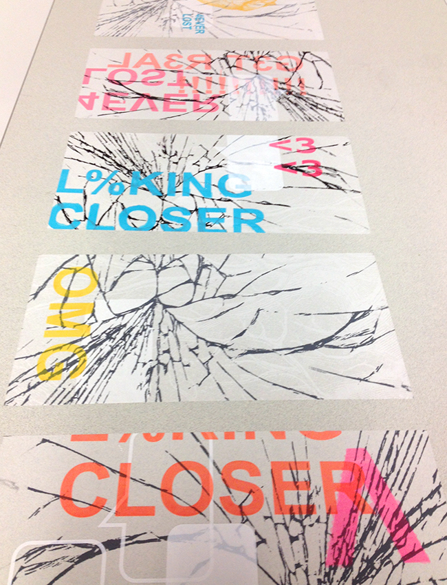
Cracking Reality, paper prints mounted on wall.
Photo by Roxanne Desrosiers.

Cracking reality, velum prints on table. Photo by Roxanne Desrosiers.

Cracking reality, velum prints on table.
Photo by Roxanne Desrosiers.

This past Wednesday was our class presentation and critique for our first assignments.

Our team project aimed to see how we could use screen printing to comment on sustainable living by comparing technological cracks that are undesirable and annoying, to the metaphorical cracks of our society in which real life and virtual life are intrinsically linked.

By doing so, we tried to take a more sustainable social and cultural approach to our very materialistic theme. The material cracks of a call phone screen are a stepping stone to something deeper. In fact, we wanted to show what hides behind our material cracks and ask the viewer “where do you stand?” amidst all this technological confusion. We hope that through our project, we were able to reach our viewers’ different narratives and make them realize that social interactions have gone rare in our society of technology. They need to look away from their screen, and into the world that surrounds them. We were very happy with the final result, and even more so that our project received a positive critique !

Overall, the other projects really impressed me; I was not disappointed by a single one. Every team worked hard to tie in sustainability with their project, and we could see that as much energy was put into the conceptual aspect of the project than on the production of the finished work.


| [FINAL PROJECT] PROPOSAL

One of the graphic elements that will be used in my animated infographics video.

One of the graphic elements that will be used in my animated infographics video.

The main goal of my project is to create a clear animated infographics video that will inform viewers about breast cancer and the marketing of its symbol, the pink ribbon. My animated video will start with the data: I will give the viewer a few general facts about the disease. Then, I will give a global picture of the marketing of breast cancer (and of the pink ribbon), in order to raise awareness in the viewer of the irony that lays behind this so-called “noble cause”, and highlight the need for harmony in the many organizations that represent it. I will use animated simple graphic elements, quotes and typography (itself animated), as well as sound and visual effects in order to bring to life this delicate subject matter. Also, I plan to have narration in my video: it will most likely be a female voice, that will tell the story in a rather humorous tone. By doing so, I hope to touch my audience, as well as make them realize the urgency to act and ask questions in order to find the proper cure and finally put an end to the epidemic that is breast cancer.

Click on the link below to view my brainstorming process for the video, the gathering of data and the sketched storyboard for my animation.

DART381_PROPOSAL_2013

| Think Before You Pink

While I was watching Léa Pool’s documentary Pink Ribbons, Inc. as part of my research for the final assignment of my multimedia class, I learned about an organization called Think Before You Pink. This specific organization is a project of Breast Cancer Action, which was launched in 2002 in response to the growing concern about the overwhelming number of pink ribbon products and promotions on the market. Their campaign calls for more transparency and accountability by companies that take part in breast cancer fundraising, and encourages consumers to ask critical questions about pink ribbon promotions.

The truth is that companies put pink ribbons on absolutely anything in the name of breast cancer, and this year is no exception; you can find the pink ribbon symbol on cleaning agents, groceries, toilet paper, office supplies, beauty products, apparel, alcohol… you name it ! (Karuna Jaggar, Executive Director of the organizationOdds are you can find a pink ribbon option almost anywhere.

This website helped me a lot for my documentation and data gathering for my infographic video about breast cancer, since it addresses the matter with the critical eye I was looking for. I think that it is important to raise awareness of this tidal wave of pinkwashing, especially as we are halfway through Breast Cancer Awareness Month.