Cracking Reality, paper prints mounted on wall.
Photo by Roxanne Desrosiers.
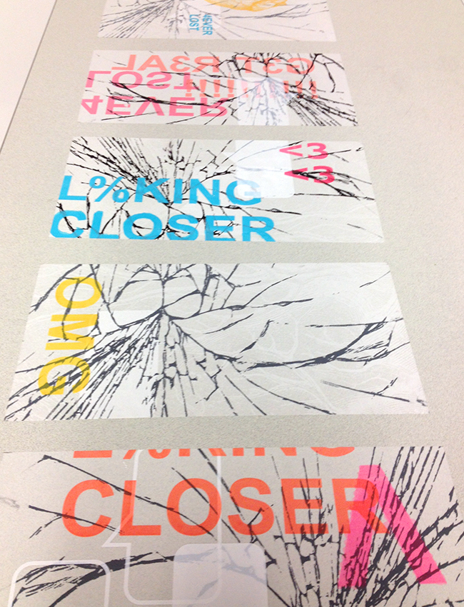
Cracking reality, velum prints on table.
Photo by Roxanne Desrosiers.
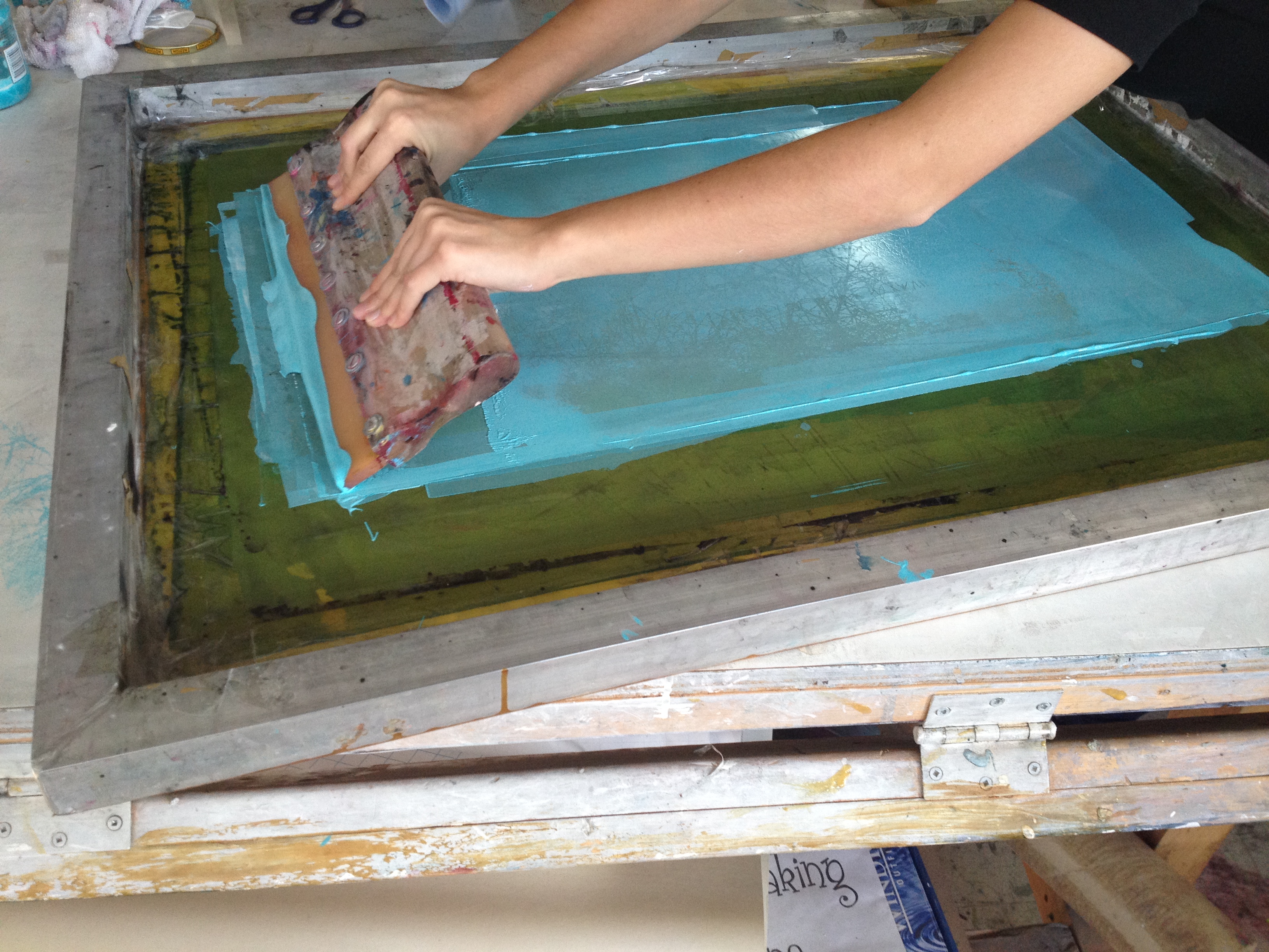
This past Wednesday was our class presentation and critique for our first assignments.
Our team project aimed to see how we could use screen printing to comment on sustainable living by comparing technological cracks that are undesirable and annoying, to the metaphorical cracks of our society in which real life and virtual life are intrinsically linked.
By doing so, we tried to take a more sustainable social and cultural approach to our very materialistic theme. The material cracks of a call phone screen are a stepping stone to something deeper. In fact, we wanted to show what hides behind our material cracks and ask the viewer “where do you stand?” amidst all this technological confusion. We hope that through our project, we were able to reach our viewers’ different narratives and make them realize that social interactions have gone rare in our society of technology. They need to look away from their screen, and into the world that surrounds them. We were very happy with the final result, and even more so that our project received a positive critique !
Overall, the other projects really impressed me; I was not disappointed by a single one. Every team worked hard to tie in sustainability with their project, and we could see that as much energy was put into the conceptual aspect of the project than on the production of the finished work.